When embarking on a web development project, choosing between responsive and adaptive design is a crucial decision that impacts user experience, development effort, and overall project success. Both approaches aim to optimize the web experience across various devices and screen sizes, but they differ in methodology, benefits, and best use cases. Understanding these differences can help determine which approach better suits your project needs and user expectations.
Responsive Design
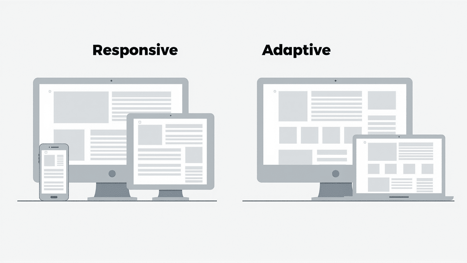
Responsive design is a fluid and flexible approach that uses CSS media queries to adapt a website's layout to fit the screen size, orientation, or resolution of any device. It operates on the principle of a single layout that morphs and adjusts based on the user’s screen, delivering a consistent experience across all devices.
Advantages of Responsive Design:
-
Single Codebase: With responsive design, there's only one set of code to manage, making development and maintenance more straightforward and cost-effective.
-
Consistency: Users enjoy a seamless experience as they move from one device to another, with the site adjusting smoothly without any need for additional templates.
-
Future-Proofing: Responsive design is inherently flexible, allowing it to accommodate new devices and screen sizes with minimal adjustments to the existing codebase.
Drawbacks of Responsive Design:
-
Performance Issues: Because responsive websites often load the same content across devices—then scale or hide it—they may suffer from slower load times, particularly on mobile devices with limited bandwidth.
-
Complexity in Design: Creating a one-size-fits-all layout can be challenging, especially for websites with intricate designs that require special considerations for varying screen sizes.
Adaptive Design
Adaptive design, alternatively, employs a set of static layouts corresponding to specific screen sizes. Instead of a single fluid layout, adaptive design detects the screen size and loads the appropriate layout for that specific resolution.
Advantages of Adaptive Design:
-
Optimized Performance: Since adaptive design delivers device-specific layouts, it can result in faster load times and optimized performance for each device.
-
Tailored Experiences: By focusing on distinct layouts, adaptive design allows for more carefully crafted user experiences on different devices, catering to unique user behaviors and expectations.
-
Control over Design: Developers can fine-tune each layout to match the intended user experience, ensuring optimal presentation on all target devices.
Drawbacks of Adaptive Design:
-
Increased Development Time and Cost: Multiple templates mean more code to write, test, and maintain, which can lead to longer development cycles and higher costs.
-
Device Dependency: Adaptive design requires regular updates to maintain compatibility with new devices and screen resolutions as they enter the market.
Choosing the Right Approach
Selecting between responsive and adaptive design depends largely on the specific needs and constraints of your project:
-
Simpler Projects with Limited Resources: For websites that require quick deployment and ease of maintenance, responsive design is often the more suitable choice due to its single codebase and flexibility.
-
High-Traffic Sites with Performance Concerns: Adaptive design may be advantageous for projects where performance is paramount, such as e-commerce platforms or media-heavy sites, as it allows for fine-tuning across specific devices.
-
Audience Specifics and Expectations: If your target audience primarily uses a few types of devices, adaptive design allows for precise optimization. Conversely, a diverse audience may benefit from the universal accessibility of responsive design.
In conclusion, both responsive and adaptive designs have their merits and challenges. Responsive design offers simplicity and ease of maintenance, ideal for projects where flexibility and broad accessibility are key. On the other hand, adaptive design provides fine-tuned control over the user experience, making it suitable for projects where performance and personalization are critical. By carefully considering your project goals, audience needs, and technical requirements, you can choose the design approach that will deliver the best results.